From grey to buzzing
New identity
💡
Inovèla
💡
New identity 💡 Inovèla 💡

-
✺
Objective:
Develop a brand that reflects who Inovèla are – and where they’re going. -
✺
Contributions:
Insight gathering, design direction and client guidance. -
✺
Results:
An easy to navigate brand identity, aligned with the brand’s values.
Concept
But after doubling in size (again), it was time for a proper reset. The goal was to create a brand that didn’t just look good – but felt true to their values and background.
When Inovèla was first founded, branding wasn’t exactly a priority. Thus, they had no real visual identity – just a placeholder logo and a bare-bones website.
A logo animation I made to present the brands new identity.
Execution
1) Understand the people behind the brand
The brand was deeply tied to the founders’ personal identities. My first task was to help them draw the line between who they are as people – and who they are as a company.
Through collaborative workshops, I gathered insights around their values, ambitions, and day-to-day work. This laid the foundation for a brand that felt both authentic and directional.
2) Build trust through collaboration
Once the brand direction was in place, I teamed up with my Creative Director, Samuel, to explore visual expressions. He developed early options for logos, colour palettes and typography, which I helped refine and contextualise through colaborative discussions and a series of styleframes.
Some of our initial proposals were met with hesitation – a natural reaction for a client so personally tied to the business. My role was to guide them through that process: explain design choices, offer context, and show how each element could scale with the company’s growth.
After aligning on a direction, I took the lead on consolidating the final identity into a clear and usable brand book – outlining how to apply the system across channels and empowering the client to use it with confidence.
The initial styleframes


Result
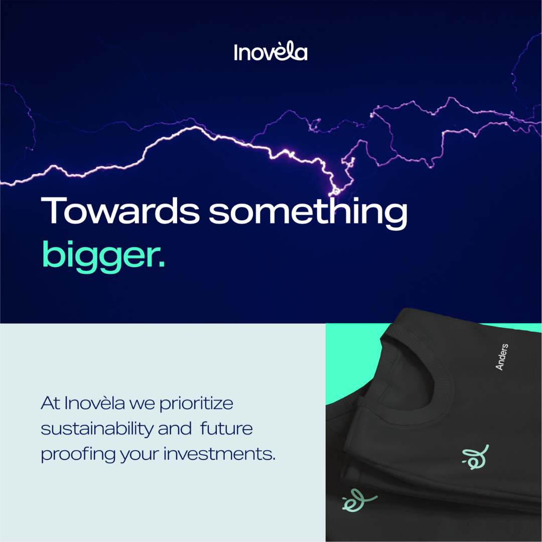
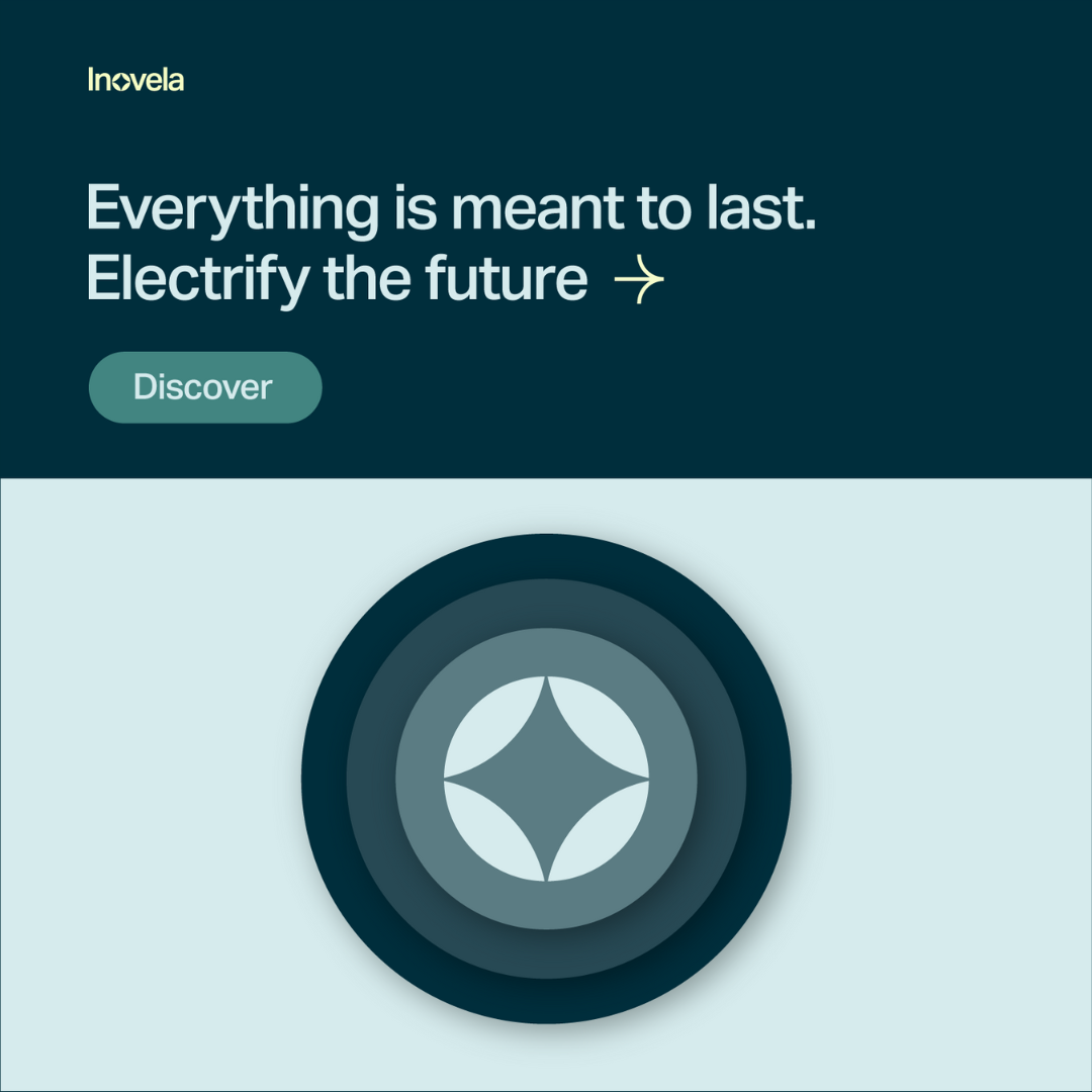
The final identity needed to speak to two audiences at once: future talent and current customers. To stand out in a competitive job market, the brand had to feel modern and memorable. But to connect with overwhelmed buyers, it also needed to feel approachable and clear.
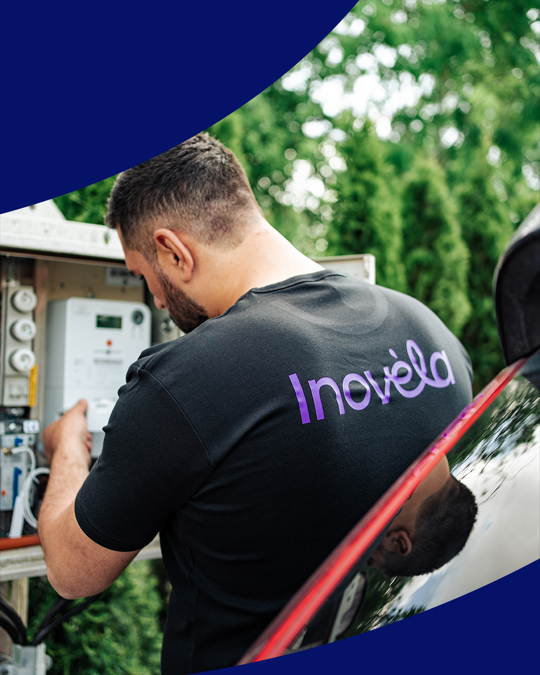
The logo
Visually, the identity leans into softness and simplicity. The final logo was the roundest of all proposed options – a deliberate shift away from the cold, technical aesthetics common in the industry.
It balances straight, clean-cut characters with a handwritten ligature – almost evoking a med-tech or wellness brand. But more importantly, it signals care, clarity and ease.
It even hides a small easter egg. The brand’s key motion element is the apostrophe flipping like a light switch. A playful nod to the core business – but also a subtle tribute to a real legal mishap. The mirrored form came from an accidental company registration, but proved too fun not to keep. So it became part of the story.
A brand-animation, made by me.
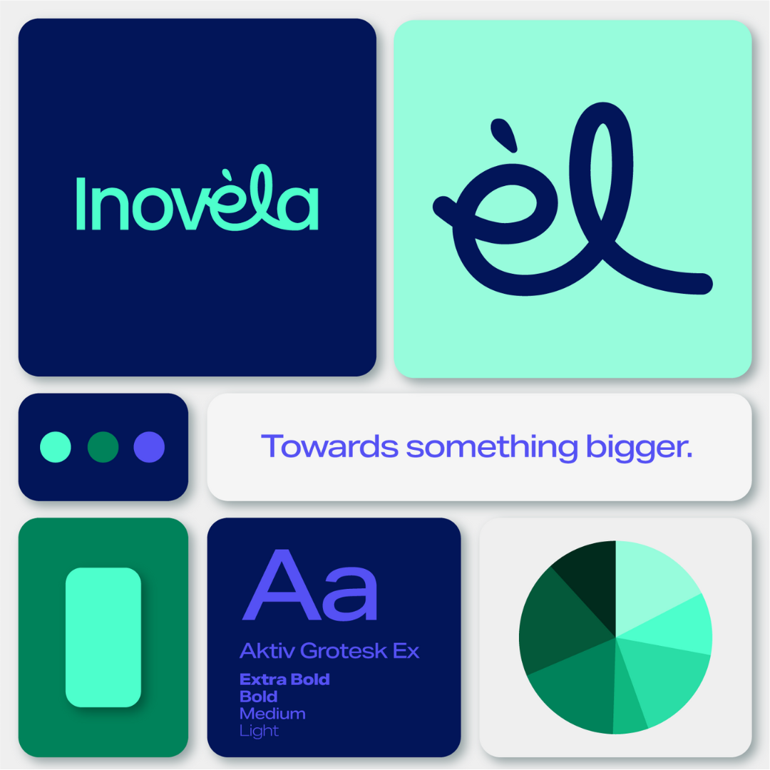
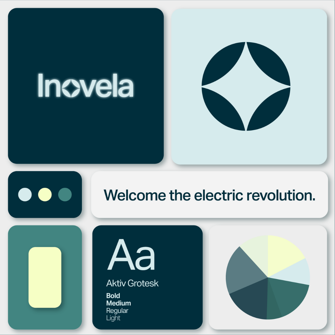
Colour palette
The brand’s colour system strikes a balance between electricity and clarity. Accent colours are intentionally bold – designed to energise and draw attention. Supported by calmer, more grounded tones, the palette becomes energetic, but never chaotic.
Typography
The choice of Aktiv Grotesk Extended brings a subtly futuristic edge to the brand. Its geometric shapes feel structured and modern, while the soft curves keep it accessible and human.
That duality was central to Inovèla’s identity: a brand that needed to be tech-adjacent without being intimidating. Aktiv Grotesk helped bridge that gap – modern, confident, but still warm. For hierarchy and legibility, we used the extended variant for all headlines and the standard width for body copy.

An overview of the brand.